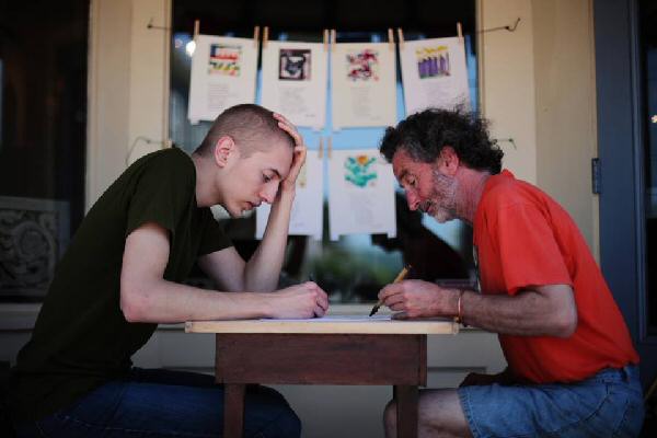
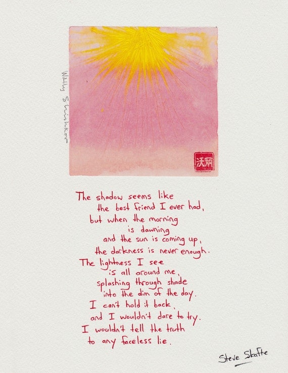
Steve Skafte of Bridgetown, and Wally Shishkov of Bear River, Nova Scotia, have combined their talents to simultaneously create a cohesive piece of artwork called Painting Poems. I was particularly intrigued at how poet & painter can work silently together yet have the end result manifest the perfect mood/emotion – with Wally painting upside down, no less! Learn more about the artists & their process in this interview with Steve Skafte.
How long have you been creating painting-poems?
The very first piece that we did was on May 20, 2013. We began on a blank sheet, with no preparation or fore-thought whatsoever.
What made you start creating painting-poems?
We both survive almost entirely off the income of what we create, so economical reasons are almost as pressing as creative ones. I (Steve Skafte) had been thinking a lot about busking and street performance, and it was just getting into the season where warmth makes that sort of thing possible (or at least comfortable) in Nova Scotia. I came across a TED talk by Amanda Palmer where she talked about the concept of allowing people to give in return for art, rather than the idea of constantly demanding payment. I was already planning to take to the street with the idea of writing poetry live when a conversation with Wally Shishkov turned me in the direction of collaborative creating. There was a real desire to be seen for both of us. Art is more invisible than ever before in rural Canada, shoved into dark corners and only drug out with the notion of group expression or with the drive of government funding. We were tired of waiting to be accidentally discovered, so we decided to put ourselves in the path of passing traffic. There was never any urge for performance, just a nervous and open-hearted sharing. What could we do but create? For all the people hawking their finished products, it seemed to mean so much more for them to see it coming alive.
What inspires your designs?
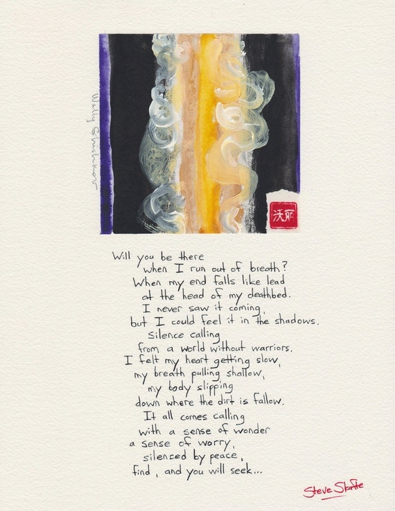
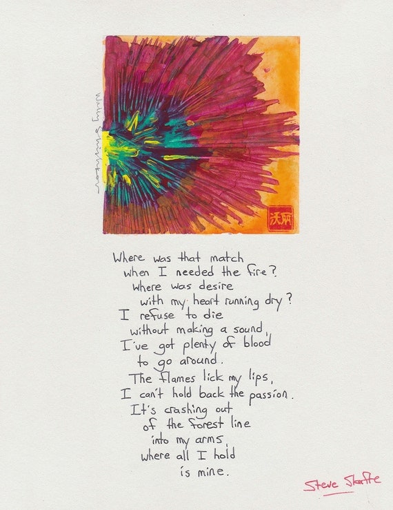
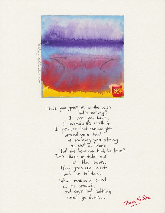
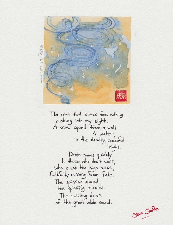
Dreams, nature, water. Water more than anything, that’s part of working with watercolours, I suppose. Wavelengths, lightwaves, electrical impulses, magnetism. Without waves, where would we be, what could we see? Nowhere and nothing. The images start swirling, and they eventually find their way or dry their way to completion. Geometric shapes, lines and crosses and circles. The patterns of frost, the growth of crystals. We begin every creation live and at the same time, so as Steve writes and Wally paints upside-down, there’s a rush to the end, or at least to discover where the end is. In the end, the inspiration is the word. We pick that word, the title of the painting-poem, and try as best we can to express the full and whole emotion of what that word means to us. The shape is almost always entirely unexpected. It’s hard to know where it comes from.
What are your favorite pieces to make/creations you have made?
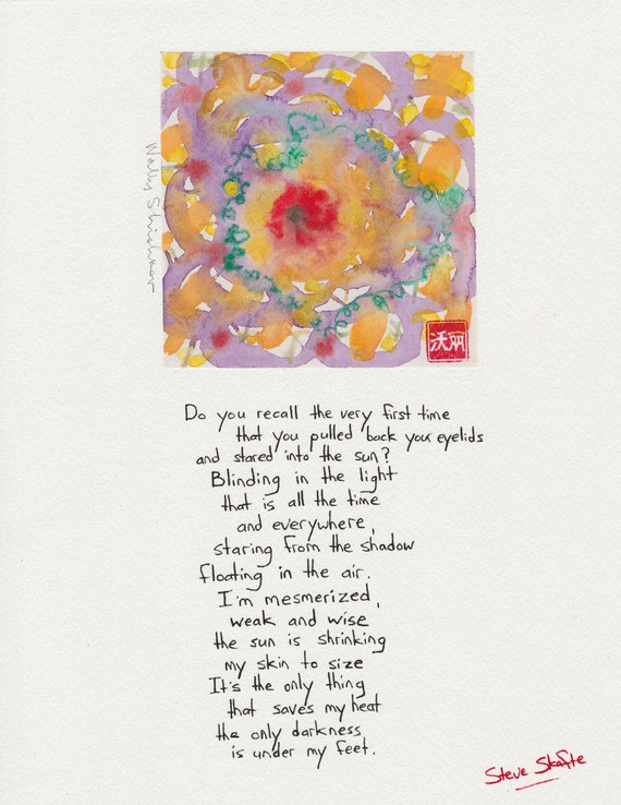
There’s one called “Exodus” that was particularly hard to part with. A lot of the pieces hang on heavily from the meaning of the words. The images mean a lot to us, but the words are a story, a one-of-a-kind journey to a place we’ve never been and will never be again. The wide-eyed smiles and sometimes tears in the eyes and on the faces of friends and strangers when they see the painting-poem come alive, fully improvised in front of them, just for them, that’s worth a lot. I think of a few pieces where the joy and sorrow was beyond compare, and we were deeply humbled and honored to share it. “Heartbeat”, was one. “Gypsy” was another, for a woman we’ll never forget. One called “Solitude” carried a woman back to the death of her mother, and we didn’t mean it that way, but it was exact to the strangest detail. “Transformation”, done on the street for a friend named Stephanie, was the most personal of experiences. Between the two of us creating, with her and her boyfriend watching, it was almost religious in nature. Nothing has ever felt so right. There’s a line in a piece called “The Gift” that says: “The gift we have is the gift we’re giving,” and that’s the real depth of it, I think. The ones that mean the most to us are the ones that meant the most to others.
Where do you sell your work?
We sell on the street live when we create, or inside at what shows we can get when the weather is colder. A binder of our 8.5×11 work is available for view at Low Tide Gallery (4 Queen Street, Bridgetown, Nova Scotia) as well as a handful of our 16×20 pieces. Online, we sell all of our currently available work in our Etsy shop, but all sold and unsold works can be browsed on Facebook.
Do you accept custom work?
Absolutely! About 1/3rd of all our work is requested. Unlike most art, requests are more like conversational ideas than demands. We start with a word (or sometimes a two/three word title) and sometimes a little background of what it means to them, then create from there. If you’d like us to do a piece for you, go to our Etsy shop and click the “Request Custom Order” button.
I own 3 Painting Poems for my Bridgetown home, & look forward to possessing more.
To see/learn more:
visit Steve & Wally’s etsy shop
follow them on Facebook
![]()
Are you an artist inspired? I’m looking to share your story here and in my monthly newsletter. Inspire me; inspire others! E-mail me or leave a comment below to be considered. All you need is an online presence (blog, website, Etsy shop, etc.) so that the international audience the internet attracts can get to know you & your product better. This is my contribution to the handmade/artist community, & I am honored to do so! Look forward to hearing from you…
Have you been healed by creativity? I am looking for examples to be featured here on the creativity inspired blog of how art/creativity helped you overcome loss/hardship/illness. Did you paint a picture? Get a tattoo/had art created for you, much like the Painting Poems? Plant a garden in honor of a person or event? I want to hear every & all examples of how an outward expression aided you in your process. It is my hope that others will find comfort in these inspirational stories. Please contact me directly in order to be featured, or leave me a comment below. My only requirement is that you have one picture of the finished product to share with readers. Namaste!